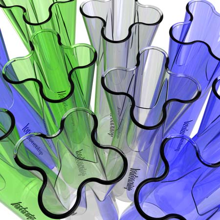
More design for London: designer Neil Barron has won a competition to design a carafe for serving tap-water in London’s restaurants, bars and hotels.
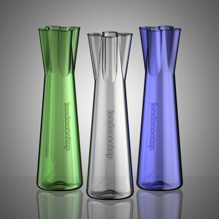
Barron’s design has four spouts and a narrow neck to trap ice cubes. The carafes will be available to the hospitality industry early in 2009.

Called London On Tap, the competition was organised by Thames Water and the Mayor of London, and the winning design was announced earlier this month. Watch a movie about the competition here.
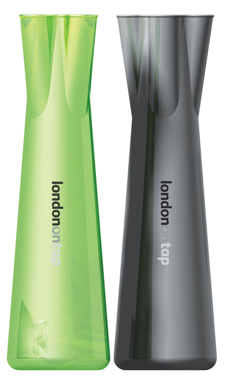
Below are the other shortlisted entries, with captions from the designers.
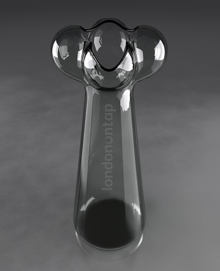
Above: Tap by Adam White.
“The idea behind my idea is simple – I have absorbed the ultimate motif for running water – a brass tap – and bottled it. If not literally, it is still embedded into an otherwise simple and modern carafe shape.
“I felt that as well as producing a form that could stand out in the visual noise of the better dressed tables in London’s restaurants, when diners paused for a second to consider the shape of the vessel, they would enjoy the moment the traditional tap came into their mind’s eye, and they got the design.”
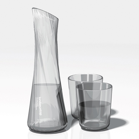
Above: Faucet by Chloë Coulson
“Faucet takes inspiration from the energy of water. The helical facet pattern plays with refracted light, through which the transparent glass creates a kinetic cross-hatched effect, reminiscent of water gushing from a tap. The etched London On Tap logo cascades down the front of the carafe.
“Clear glass is used to reflect the purity of tap water and to emphasise the play of light refracting from the moulded surfaces. The chamfered top allows for easy rear refilling from a tap whilst the narrowed waist and faceted surfaces allow the carafe to be easily gripped in one hand enabling effortless pouring from the spout. The tall and slim form is elegant and practical and would fit easily into a refrigerator door pocket.”
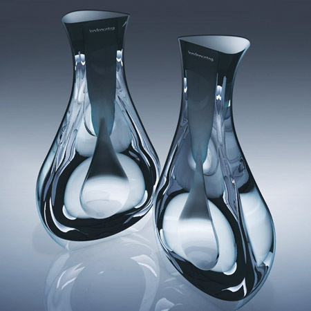
Above: Droplet by Dan Bramham
“This design at once invites philosophical reflection. The carafe is split in two in a way that may reflect London’s traditional divides (geographical and otherwise) but, when joined, the two halves are a perfect fit, suggesting that the two entities are mutually dependent. The compound shape may be seen as suggestive of London’s readiness to accept others - certainly, the design is all about the idea of unity.
“As the two halves come together, a perfect water droplet shape is created through negative space or a ‘hollow’. The symbol of the droplet is a powerful one; it enjoins us to contemplate the source of our mains water, and perhaps to consider on a deeper level the value of water to humankind. On a practical level, the two halves allow different types of water to be offered - for example, plain water in one and cordial in the other.”
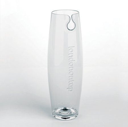
Above: Drop by Ines Sanchez Calatrava
“As water is becoming scarcer, there is a need to create awareness. In an attempt to do so, the design plays with analogies based in water and London On Tap as a brand. It abstractly renders the concept of a drop that continuously falls into a pool of water at its base which, could be understood as water wastage. It is only when we realise that what is falling inside the carafe is tap water, you understand that you are doing something good for the environment.”
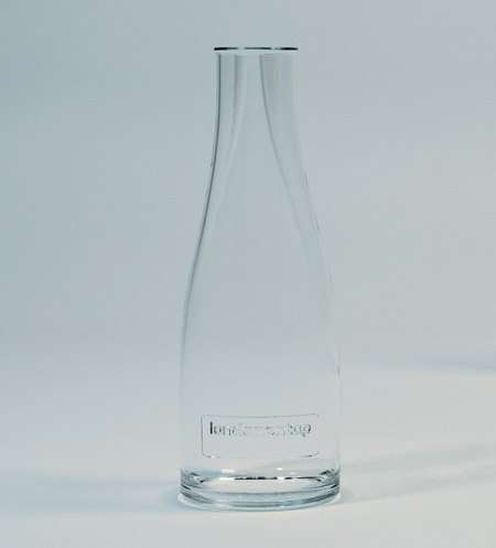
Above: Element by Jonny Freeman
“The ‘Element’ water carafe is an elegant and robust design solution for serving tap water in London. The soft ripple gives it a dynamic aesthetic, changing its silhouette through rotation, synonymous with the dynamic London city life. This minimal elegance gives it sufficient sophistication to promote tap water in a high end market, whilst being distinct enough to hold its place as an icon for the London on Tap campaign.
“The design features an innovative spout allowing controlled ice flow. The spout allows for ice to be put in the large hole whilst retaining it when pouring out the small hole. The resulting form creates a comfortable hand hold. The slender nature of the design allows for efficient use of an environment where space is limited. The carafe is boldly branded with the London on Tap logo using the wine label idiom to enhance and further promote the brand and its cause.”
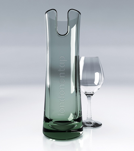
Above: Flow by Matthew Fiddimore
“Inspired by fine fragrance bottles where the quality of the glassware communicates the quality of the liquid within, Flow is a stylish and contemporary carafe that addresses the practical and commercial requirements of restaurant service. Elegantly tall with a small footprint, Flow requires little shelf space and will find room on even the tiniest tables for two.
“Referencing the meandering Thames, the beautiful deep plunging spout facilitates pouring while holding back ice. Pure in form, it complements existing restaurant glassware and its substantial base exudes quality and robustness. Flow’s internal form invites you to observe the clarity of the water and the boldly etched graphics proudly declare its tap water quality. Its flat top happily sits in any dishwasher basket and flow can even be rinsed by bar-mounted glass rinsers. Made from recycled glass in crystal clear or green, Flow’s purity of form echoes the purity of the water it holds.”
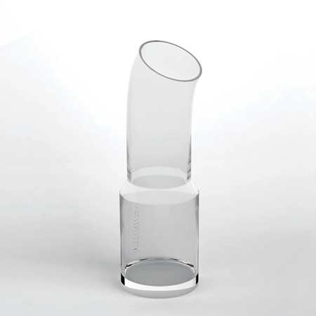
Above: Connected Pipe by Nina Tolstrup
“The provision of tap water requires a massive infrastructure of piping, pumps, and water purification works. The direct cost of the tap water alone is a small fraction of that of bottled water, and the transportation through the pipe systems is instant. The thickness of the water pipe and tube walls varies. Thicker walled pipe generally implies greater durability and higher pressure tolerances. I have referenced this with a graduate wall thickness of the carafe – with at robust thickness at the bottom and less thickness at the top. Wider tapered base works to keep ice at base. Generous opening for filling, and the tube bend forms generous spout for easy poring.”
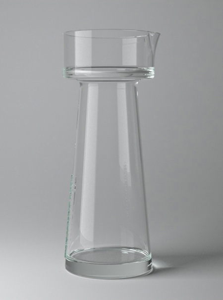
Above: Water Tower, also by Nina Tolstrup
“A water tower is a large elevated water storage container. The term tower speaks to its elevation and is constructed for the purpose of holding a supply of water at a height sufficient to pressurize a water supply distribution system. The carafe has a generous opening at the top, which makes it very quick and easy to fill with water and ice. The carafe can be made stackable for more efficient storage.”
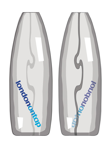
Above: Gherkin by Steve Wooster
“A clear glass carafe inspired by the iconic shape of London’s ‘Gherkin’. A recessed groove echoes the course of the River Thames. The London On Tap logo is placed diagonally, in sympathy with the window format of the Gherkin.”
The following information is from Thames Water:
–
Launched in May 2008, the competition ran for three months and received over 115 entries. Ten designs were shortlisted for final judging in September 2008 and on December 1, the Mayor of London, Boris Johnson announced ‘Tap Top’ as the winning design. Click here to see the shortlisted designs
The winning carafe, designed by London-based designer Neil Barron, will be used to serve tap water in restaurants, cafes, bars and hotels throughout the capital – underpinning the city’s commitment to providing high quality drinking water whilst reducing the environmental impact of packaging and transporting bottled water.
The competition was aimed at London based designers, to showcase the quality of design and craftsmanship associated with a city, which enjoys a reputation as the design capital of the world.
The winning designer received a one-off award of £5,000, sponsored by Thames Water.
Profits made from the sale of the carafe (after costs for set-up, manufacturing and distribution) will go to leading charity WaterAid – who provide vital water resources to some of the world’s poorest people. The minimum donation to WaterAid per carafe sold will be £1. Thames Water, The Mayor of London and the Crafts Council will make no profit from the project.
The design
The TapTop restaurant tap water carafe is derived from a stylised tap control to subtly reinforce the tap water message - this produces four pouring spouts which are drip-free and completely instinctive to use. The carafe is tall, tapered and elegant, yet quickly and contemporary like an inverted rocket. TapTop fits into the door of a domestic fridge. The form produces a waistline with four exits which helps to trap the ice when pouring.
The form may best suit press and blow manufacturing. The material will be predominantly recycled - it would be interesting to offer two colour/finish options. The logo is shown etched and a ‘secret’ colour logo is discovered when peering down inside the carafe (it’s printed on the base).
The designer
Neil Barron is a London based industrial designer and part-time senior tutor at the Royal College of Art. He has produced many mainstream commercial products for clients including; Intel, Boots, Thulé, Body Shop, Lego, Escada, Unilever and E.ON. Neil thrives on the challenge to create the new, but tries to think and act responsibly regards environmental, cultural and social issues.
–
Original from dezeen. |

